Tips For Building a Great Municipal Campaign Site
April 7, 2013
This post has been re-posted from Armadillo’s President’s personal web site as it touches upon a subject that we’re currently very interested in. We hope you enjoy this post and if you have any questions feel free to contact us at any time.

With a slate of “municipal elections scheduled for late October”:http://en.wikipedia.org/wiki/Alberta_municipal_elections,_2013, upstart candidates and sitting council members across Alberta are gearing up for an intense fall campaign season. With that comes the task of putting together a campaign team, beginning the process of raising funds and also crafting a campaign brand and marketing material. But one of the most critical elements of a strong campaign is establishing an online presence with a fully functional web site.
If you’re an active voter like I am, you’ve probably come across a spectrum of political campaign web sites over the past four years. You have also probably noticed that only about a handful of these site are clearly well done – majority are just absolute disasters doing more harm than good. In a previous blog post, I outlined my opinions on the state of “political web design in Canada”:http://www.ctoverdrive.ca/article/1008/where-is-the-design-in-canadian-political-web-design. But now with an election six months away, I thought I’d put my money where my mouth is by detailing a handful of *key elements for building a great campaign web site*.
Before we get into the meat of these elements, it’s important to understand the role of the candidate’s web site in the modern campaign era. Unless you understand how the typical voter will interact with your site, it’ll be impossible to grasp what characteristics are key in the process.
The Role of a Campaign Web Site
Before 2010, a candidate’s web site typically acted as the single online activity hub of a campaign. Since then we’ve obviously seen a shift in user interaction patterns, where there is now an even balance between social media activity and the campaign web site. A candidate’s web site is no longer the only element online, it’s now a key cog in three or four active and moving pieces.
Think of it this way, a candidates social media activity and print material acts as a first introduction to the average voter. The entire goal should be to get the candidate’s name in the mind’s of the voter. If a voter’s attention is caught by a tweet about a candidate, notices a friends shared Facebook post, stumbles across a Pinterest photo or drives past a yard sign, that will be their first introduction to the candidate. At which point, if the first introduction is a successful one, the voter will most likely go to the candidate’s official web site to learn more. At which point the candidate will be making their first and most lasting impression on a potential voter and you better hope that their web site hits all the right spots.
Now here is the most important change in the average user activity cycle with a campaign web site. In years past, the average user if impressed by the candidate would probably sign-up for an RSS feed, or bookmark the web site to revisit in a week or a couple weeks. But with the rise of social media, smart phones and our collective diminishing attention spans for visiting web sites on a regular basis, the average voter is going to look over the candidates site *once*, get the information they need and make a decision to either commit to subscribing to the candidate’s social media activities or to disregard the candidate. From there the social media elements of the campaign will take over and either continue to impress the average voter — potentially bringing them back to the web site for more information as the campaign rolls on or it’ll start to turn the voter away.
In this aspect a candidate’s web site may have lost a bit of its long term importance, but has also increased its value as the biggest element in *making a lasting impression on the average voter*.
So how does one create a great first impression with a strong campaign web site? Here are some key points.
Use The Right Tools
First and foremost, a campaign has to use the right tools to create an impressionable web site. From my experience building a candidate web site with Drupal or Joomla is overall kill. While very functional tools for larger sites, a Drupal and Joomla site is going to be far too complex for the average campaign team to maintain and it’s going to show in the design aesthetic or with stale content. So while this isn’t real news to anyone, my advice is to go with “WordPress”:http://www.wordpress.org or “Nationbuilder”:http://www.nationbuilder.com. Most designers and developers won’t be familiar with Nationbuilder (as a caveat I have been working to become a Nationbuilder architect and it is a great up and coming tool) so WordPress will probably be the default tool for most this cycle.
Now just because you have a WordPress web site it doesn’t mean you’ve completed your work. The biggest benefit of WordPress from a campaign perspective is it’s a very easy to use and universal tool with so many great plug-ins. WordPress is a tool that everyone and their dog can claim to build a WordPress site, but a badly crafted WordPress theme will stick out like a sore thumb. Any site that is a ‘hack’ of an already popular theme will show fairly quickly. It’ll look cheap and inexpensive and that will reflect poorly on the candidate. In my experience, this is probably the most common mistake that a campaign team will make concerning their web site.
So use WordPress, but invest in a proper design. *Create something that’s clean, intuitive, unique and memorable*.
Make Your Candidate Approachable
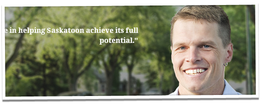
This is going to sound incredibly obvious, but a candidate’s face _has_ to be front and centre on their web site.

You’d be shocked at how many campaigns are already committing this sin for the upcoming election. As I mentioned before, a campaign web site acts as the _biggest_ first impression for the average voter, so put your candidate front and centre on the landing page. Make them the focal point of the user’s eye when they arrive.
Now before everyone goes running off to purchase fancy head shots, there is a caveat with this piece of advise — the candidates photo has to be personable.
Don’t photoshop their face and super impose it on a stock image of a robotic skyline. That is so 2009 that it hurts. Do something unique with your candidate. Be creative. Show the personality and charm of your candidate. It could be as simple as showcasing them in the area, ward they represent or in front of a well known landmark of the district they are running in. But overall the images of the candidate have to be personable to people.
Look at it this way, who would _you_ rather vote for? A candidate in a buttoned up shirt and tie sprawled across the perfect backdrop or the candidate that looks like you could run into them on your way to the grocery store or coffee shop of _your_ local neighbourhood?
Nine times out of ten, the average voter is going to take *the candidate that looks like they could have a coffee with*.
Make It Really Easy To Connect
As mentioned in this post, the role of the campaign web site has evolved. While it is still the most critical element for a first impression, it’s also not necessarily where all the online interaction of your candidate with citizens will occur — that area is regulated to the battle fields of Twitter and the timelines of Facebook.
So with that in mind, it is wise to make your candidate’s social media accounts easy to find. Make them stand out on the site. Make them super easy for voters to follow or like. Now like my previous tips of advice there is a caveat to this, don’t just go plug-in crazy with the social media accounts. They have to be easy to find, but it also doesn’t have to look as though the candidate’s web site is a dogs breakfast of the latest tools. Like everything in a campaign it has to be well thought out and intuitive, so invest in good design and simple aesthetic for the web site. *Incorporate the various social media tools, but do it in a manner that isn’t an eye sore*.
Invest In Your Web Site
The points I’ve outlined above are fairly straight forward and are based on common sense. Before embarking on a campaign, make sure you understand the role of your web site in the campaign, understand the proper tools for your web site, create a relatable design and aesthetic that represents your candidate and create an online presence that is easy for the average voter to connect with. But what all these points boil down to is ensuring that there is proper investment in a campaign web site.
From my experience, the biggest mistake a candidate can make is to not to properly invest in _all_ elements of their campaign. I have been lucky to work on a handful of great campaigns, with teams that have understood the importance of this concept, but in my research and general observations, many campaign teams in Alberta are already forgetting this simple concept. It’s almost humorous as to how many campaigns will invest large portions of their budget in printed material and online advertising to redirect potential voters to a sub-par web site for more information. With the advent of open source technology and the growing industry of web design, in my opinion there really is no excuse for candidates to have a poorly designed web site in this day and age.
Image number two is taken from “Charlie Clark’s Saskatoon Campaign site”:http://charlieclark.ca/.
